3 Selection of experimental plots
3.1 Experimental design
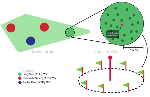
The experimental design for the red spruce monitoring effort. A circular experimental plot of radius 16m was established at the restoration site for reforestation monitoring and to assess the performance of individual sources. Each experimental plot consisted of forty plants from a single source to reflect the planting density of the reforestation activity. These single source experimental plots were marked with a central metal rod capped with a bright orange cap along with GPS coordinates to make it easier for tracking down these plots for future monitoring efforts.
3.2 Randomization of plots
Software: ArcGIS Pro v.2.6.0.
Create a project
Insert -> New Map – to open the map viewer
Insert -> Layout – to open the layout of the map, so that it can be exported properly
3.2.1 Map pane
Select Map ribbon -> Basemap -> USA topo maps (or any base map of choosing)
Select the shape file on the left navigation pane -> Appearance ribbon at top -> slide the slider to choose the transparency ->
set to 20%
Create random points within the Polygon/shape file
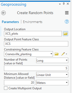
Geoprocessing -> Toolboxes -> Data Management Tools -> Sampling -> Create random points
Set the settings as shown here
1. Output location: Place to store the shape files for the new polygon object
2. Output point feature class: Name of the new point/ shape file to be created
3. Number of Points – “Long”
4. Enter the number of points needed
5. Minimum allowed distance – Linear Unit
6. Enter the distance between the points in meters
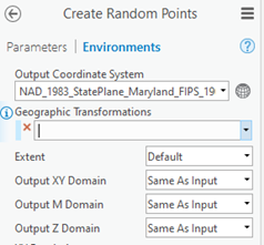
Switch to environment tab
1. Change output coordinate system to the layer you are working with currently.
Click Run
Re-run the process till you get acceptable locations for the plots
Add buffer around the points
This step is done to see how much each plot take place within an area and to make sure the plot boundaries do not overlap.
Geoprocessing -> Analysis Tools -> Proximity -> Buffer
- Steps are similar to creating the random points as described above.
- Set buffer distance (radius of the plot) + 2m as buffer for each point.
Merge points together
Geoprocessing -> Data Management Tools -> General -> Merge
Add coordinates
Geoprocessing -> Data Management Tools -> Features -> Add XY Coordinates
Add labels to the points
Select layer -> Click Labeling -> Label
Set Field to column with ID that needs to displayed.
Use Callout to add the label to the points.
Set Label Placement to Basic Offset Point.
Change color based on the naming convention:
Appearance -> Symbology -> Unique Values
Set Field to ID column.
Click the expression builder button next to Field.
Left($feature.”ID_column”, “number of letters/numers to select”)Click Verify to check the output
Convert to shapefile
Geoprocessing -> Conversion -> Feature Class To Shapefile
Export attribute table
Geoprocessing -> Conversion -> Table To Excel
3.2.2 Layout pane
Add map
Insert -> Map Frame -> Map
- Click on the map frame and Activate in order to interact with the map
- To deactivate the map frame
- Activated Map Frame ribbon -> Close Activation
Add compass
Select the Insert tab within the layout pane -> North Arrow ->Arc GIS North 13 arrow
Add border to map
- Stay within the insert tab.
- Click on the map frame.
- Click Grid
- Click Black Horizontal Label Graticule
- Click "Map Frame” tab -> Gridlines -> Set color to “No color”
Add legend
Insert tab -> Legend -> Draw the legend
- Click Legend -> Format -> Choose text
- Right click on Legend on the left navigation pane -> Properties
- Change settings accordingly
- Select “Show properties..” under Legend items
- Select Items to show on the legend on the navigation pane check box
- Once done; right click on the legend layer -> Convert to graphics
- Now remove items/edit items freely