
dir.create("data/raw", recursive = TRUE, showWarnings = FALSE)
download.file(
"https://raw.githubusercontent.com/anoobvinu07/Genomic_assisted_selection/master/data/FitnessTraits_GeneticParameters_RedSpruce.txt",
destfile = "data/raw/red_spruce_fitness_traits.txt")R: Population Genetics Foundations
hpc
r
foundations
github
popgen
Allele frequencies, heterozygosity, and a first genotype–environment association
PART I
Goal
Apply your R skills to population-genetics concepts: allele frequency, heterozygosity, genetic diversity, and a first genotype/phenotype–environment association (GEA), using the genetic-parameter columns already present in the red-spruce dataset (PC1, PC2, Family_Homozygosity, Population_Homozygosity, Genetic_Diversity, Genetic_Load).
We don’t have a raw genotype (VCF) file for this dataset, so this module teaches the underlying math with a small simulated SNP matrix, then applies the same reasoning to the real, pre-computed genetic-parameter columns already in your data.
Prerequisites
1. Data required data from github
ImportantDownload data
Download the raw GitHub file directly into data/raw/
Copy the code below and run it inside the cluster-exercise directory
The -L flag tells curl to follow redirects, and -o specifies the local output file. Verify the download before doing any analysis:
Recreate the rest of the project layout if you don’t already have it:
dir.create("results", showWarnings = FALSE)
dir.create("src", showWarnings = FALSE)
ImportantProject directory setup
This excercise assumes the project folder follows the following structure:
cluster-exercise/
 ├── data/
 │   └── raw/       # downloaded, unchanged source data
 ├── logs/          # Slurm standard output and error logs
 ├── results/       # analysis products created by R
 └── src/           # R and Slurm scripts
2. Install the packages used here:
  install.packages(c("vegan", "here"))
  # Optional, for working with real genotype/VCF files beyond this module:
  # install.packages("BiocManager")
  # BiocManager::install(c("vcfR", "adegenet"))
Learning objectives
By the end of this module you should be able to:
- Explain what allele frequency, observed heterozygosity, and expected heterozygosity mean
- Represent genotypes as a simple numeric matrix (0/1/2 coding) and compute allele frequencies from it
- Compute observed vs. expected (Hardy-Weinberg) heterozygosity per locus and interpret the difference
- Run a PCA on genetic markers with
prcomp()and interpret PC1/PC2 in a population-genetics context - Test a simple genotype/phenotype–environment association using correlation and linear models
- Recognize the step from a simple correlation to a multivariate method (RDA) used in real genotype-environment association work
- Know when to move from a plain R matrix to dedicated packages (
vcfR,adegenet) for real VCF-scale data
R for bioinformatics quick reference
| Function/package | Purpose | Example |
|---|---|---|
matrix() |
Build a genotype matrix | matrix(..., nrow, ncol) |
sample() |
Randomly draw values, optionally with replacement and specified probabilities | sample(0:2, 300, replace = TRUE, prob = c(0.4, 0.4, 0.2)) |
rownames/ colnames |
Get or assign labels for matrix rows and columns | rownames(geno) <- paste0("ind_", 1:n_ind) |
paste0 |
Convert inputs to text and concatenate them with no separator | paste0("ind",1:30) |
colMeans() |
Column-wise means (used for allele freq.) | colMeans(geno) / 2 |
table() |
Count occurrences of each value | table(pop_1$genotype) |
prop.table() |
Convert counts to proportions | prop.table(table(pop_1$genotype)) |
rbind() |
Stack data frames row-wise | rbind(pop_1, pop_2) |
prcomp() |
Principal component analysis | prcomp(geno, scale. = TRUE) |
cor.test() |
Test correlation between two variables | cor.test(x, y) |
lm() |
Fit a linear model | lm(y ~ x1 + x2, data = df) |
vegan::rda() |
Redundancy analysis (multivariate GEA) | rda(Y ~ x1 + x2, data = df) |
vcfR::read.vcfR() |
Read a real VCF file (beyond this module) | read.vcfR("file.vcf") |
adegenet::genind |
Genotype container object (beyond this module) | df2genind(...) |
Basics of population genetics via simulation
A minimal SNP genotype matrix in R
Genotypes at a biallelic SNP are usually coded as the count of the alternate allele: 0 (homozygous reference), 1 (heterozygous), 2 (homozygous alternate). Let’s simulate a toy dataset — 30 individuals, 10 loci:
set.seed(123)
n_ind  <- 30 # number of individuals
n_loci <- 10 # number of SNP loci
This code creates a simulated genotype matrix where rows are individuals, columns are SNP loci, and each cell contains a diploid genotype coded as 0, 1, or 2.
geno <- matrix(
  sample(0:2,                # sample values from 0, 1 or 2
  n_ind * n_loci,            # no. of draws 30 x 10 or size of the matrix
  replace = TRUE,            # each genotype category can be drawn repeatedly
  prob = c(0.4, 0.4, 0.2)),  # sampling probability for genotypes 0,1 and 2
  nrow = n_ind,              # number of rows - filled with ind IDs
  ncol = n_loci              # number of columns - filled with SNP IDs
)rownames(geno) <- paste0("ind_", 1:n_ind)
colnames(geno) <- paste0("locus_", 1:n_loci)
geno[1:5, 1:5] locus_1 locus_2 locus_3 locus_4 locus_5
ind_1 1 2 0 1 0
ind_2 0 2 1 0 1
ind_3 0 0 1 1 1
ind_4 2 0 1 0 1
ind_5 2 1 2 1 1Allele frequencies
Allele frequency is the proportion of all gene copies at a locus that are a particular allele. \[p + q =1\]
Each genotype value is the count of the alternate allele out of 2, so the mean genotype divided by 2 is the alternate allele frequency for that locus:
alt_freq <- colMeans(geno) / 2
ref_freq <- 1 - alt_freq


data.frame(locus = names(alt_freq),       # col 1 filled with locus names
           alt_freq = round(alt_freq, 3), # col 2 filled with alt freq
           ref_freq = round(ref_freq, 3)) # col 3 is filled with ref freq
locus alt_freq ref_freq
locus_1 locus_1 0.400 0.600
locus_2 locus_2 0.383 0.617
locus_3 locus_3 0.383 0.617
locus_4 locus_4 0.367 0.633
locus_5 locus_5 0.400 0.600
locus_6 locus_6 0.317 0.683
locus_7 locus_7 0.417 0.583
locus_8 locus_8 0.400 0.600
locus_9 locus_9 0.367 0.633
locus_10 locus_10 0.450 0.550PART II
Goals
In this exercise, you will simulate genotypes for two populations at one biallelic locus, calculate observed allele and genotype frequencies, compare the populations, and combine them into a single dataset.
Learning objectives
By the end of this section of the module, you should be able to:
- Use
sample()to simulate diploid genotypes (AA,Aa, andaa).
- Calculate genotype frequencies from observed genotype counts.
- Calculate allele frequencies (p) and (q) from genotype counts.
- Compare populations with different allele frequencies and population sizes.
- Combine population-level data with
rbind().
- Explain why combining structured populations can change apparent genotype frequencies, even when each population was generated under Hardy–Weinberg expectations.
Simulating two populations at one locus
Lets start off by creating two populations with of same size (n=20), but different allele A frequency. This exercise simulates genotypes at one biallelic locus in two populations. You will use sample() to assign genotypes, calculate genotype frequencies with table() and prop.table(), then combine populations with rbind().
For this example, the two alleles are A and a, with three possible diploid genotypes:
| Genotype | Meaning |
|---|---|
| AA | Two copies of allele A |
| Aa | One copy of A and one copy of a |
| aa | Two copies of allele a |
At a biallelic locus:
\[p + q = 1 \] where,
p is the frequency of allele A and;
q is the frequency of allele a.
Under Hardy–Weinberg expectations, genotype probabilities are:
\[AA = p^2\] \[Aa = 2pq\]
\[aa = q^2\]
The code below uses those probabilities to generate individuals in each population. Because genotypes are randomly sampled, observed frequencies will usually be close to but not identical to the expected frequencies.
set.seed(42)


# Population 1: 20 individuals; allele A frequency p = 0.80
p_1 <- 0.80
q_1 <- 1 - p_1


pop_1 <- data.frame(population = "Pop_1",
                    # sample function for choosing genotypes
                    genotype = sample(c("AA", "Aa", "aa"), # possible genotype values
                      size = 20,                           # no. of individuals to simulate
                      replace = TRUE,                      # genotypes can  occur more than once
                      # p2 + 2pq + q2
                      prob = c(p_1^2, 2 * p_1 * q_1, q_1^2)) # probability of each genotype
                      )


head(pop_1) # peek into the pop_1 dataframe
population genotype
1 Pop_1 Aa
2 Pop_1 Aa
3 Pop_1 AA
4 Pop_1 Aa
5 Pop_1 Aa
6 Pop_1 AA# Population 2: 20 individuals; allele A frequency p = 0.30
p_2 <- 0.30
q_2 <- 1 - p_2
pop_2 <- data.frame(population = "Pop_2",
genotype = sample(c("AA", "Aa", "aa"),
size = 20,
replace = TRUE,
prob = c(p_2^2, 2 * p_2 * q_2, q_2^2))
)
head(pop_2) # peek into the pop_2 dataframe population genotype
1 Pop_2 Aa
2 Pop_2 aa
3 Pop_2 AA
4 Pop_2 AA
5 Pop_2 aa
6 Pop_2 AaFor population 1, where p = 0.80 and q = 0.20, the expected genotype frequencies are: \[AA = 0.80^2 = 0.64\] \[Aa = 2 \times 0.80 \times 0.20 = 0.32\]
\[aa = 0.20^2 = 0.04\] Therefore, Population 1 should countain mostly AA individuals.
For Population 2, where p = 0.30 and q = 0.70, the expected genotype frequencies are: \[AA = 0.30^2 = 0.09\] \[Aa = 2 \times 0.30 \times 0.70 = 0.42\]
\[aa = 0.70^2 = 0.49\] Therefore, population2 should contain mostly aa individuals.
Calculate genotype frequencies
Use table() to count each genotype and prop.table() to convert those counts into frequencies.
# Count observed genotypes in each population
geno_count_pop1 <- table(pop_1$genotype)
geno_count_pop2 <- table(pop_2$genotype)


# Convert genotype counts to genotype frequencies
geno_prop_pop1 <- prop.table(table(pop_1$genotype))
geno_prop_pop2 <- prop.table(table(pop_2$genotype))


# Combine individuals from the two populations
pooled_population <- rbind(pop_1, pop_2)


geno_count_pooled <- table(pooled_population$genotype)
geno_prop_pooled <- prop.table(table(pooled_population$genotype))


# Build one comparison table
geno_summary <- data.frame(
  genotype = c("AA", "Aa", "aa"),
  count_pop1 = as.integer(geno_count_pop1[c("AA", "Aa", "aa")]),
  freq_pop1  = as.numeric(geno_prop_pop1[c("AA", "Aa", "aa")]),
  count_pop2 = as.integer(geno_count_pop2[c("AA", "Aa", "aa")]),
  freq_pop2  = as.numeric(geno_prop_pop2[c("AA", "Aa", "aa")]),
  count_pooled = as.integer(geno_count_pooled[c("AA", "Aa", "aa")]),
  freq_pooled  = as.numeric(geno_prop_pooled[c("AA", "Aa", "aa")])
)


geno_summary
genotype count_pop1 freq_pop1 count_pop2 freq_pop2 count_pooled freq_pooled
1 AA 9 0.45 2 0.1 11 0.275
2 Aa 10 0.50 10 0.5 20 0.500
3 aa 1 0.05 8 0.4 9 0.225# The genotype frequencies should sum up to 1.
sum(geno_prop_pop1)[1] 1sum(geno_prop_pop2)[1] 1sum(geno_prop_pooled)[1] 1Calculate allele frequencies
Genotype frequencies describe the proportion of individuals in each genotype class. Allele frequencies instead count all gene copies. Each diploid individual carries two allele copies:
| Genotype | Number of A alleles | Number of a alleles |
|---|---|---|
| AA | 2 | 0 |
| Aa | 1 | 1 |
| aa | 0 | 2 |
\[p_{A} = \frac{2n_{AA} + n_{Aa}}{2N} \]
\[q_{a} = \frac{2n_{aa} + n_{Aa}}{2N} \] Where each AA individuals contributes two A alleles, each aa individual contributes two aa alleles, and each heterozygote contributes one copy of each allele.
To calculate the allele frequency for Population 1:
# Count each genotype in Population 1
counts_1 <- geno_count_pop1


# Number of individuals
N_1 <- nrow(pop_1)


# Count A and a allele copies
n_A_1 <- 2 * counts_1["AA"] + counts_1["Aa"]
n_a_1 <- 2 * counts_1["aa"] + counts_1["Aa"]


# Convert allele counts to allele frequencies
p_A_1 <- n_A_1 / (2 * N_1)
q_a_1 <- n_a_1 / (2 * N_1)


p_A_1
AA
0.7 q_a_1 aa
0.3 p_A_1 + q_a_1AA
1 Excercises
Exercise 1 — Allele frequencies for Population 2
Estimate the allele frequencies \(p_A\) and \(q_a\) for Population 2, following the same steps used for Population 1: count genotypes, count allele copies, and divide by \(2N\). Verify that \(p + q = 1\).
Exercise 2 — Allele frequencies for the pooled population
Compute the allele frequencies for the pooled population (Pop_1 + Pop_2). Compare them to the within-population values, and explain the pattern: where does the pooled estimate fall, and why?
Exercise 3 — Pooling changes genotype frequencies
Using the geno_summary table you built earlier:
- Compute the expected genotype frequencies for the pooled population from its allele frequencies (\(p^2\), \(2pq\), \(q^2\)).
- Compare them to the observed pooled genotype frequencies.
- Compute the expected genotype frequencies you would get by averaging the two populations’ own H–W expectations.
- Which comparison do the observed pooled frequencies resemble more? Why?
Exercise 4 — Allele frequencies from the genotype matrix
Return to the 30 individuals \(\times\) 10 loci matrix geno from Part I.
- Compute the alternate allele frequency for every locus by hand using allele counting (
2*n2 + n1divided by2*N), notcolMeans(). - Verify that your result matches
colMeans(geno) / 2exactly. - Compute the minor allele frequency (MAF) for each locus. Which locus is closest to fixation? Which is most variable?
Exercise 5 — Explore the simulation
Change one thing at a time and re-run the whole Part II pipeline. Before you run each variant, write down what you expect to happen; then check.
- Sample size: set both populations to
size = 500. Do observed frequencies land closer to the H–W expectations? - Similar populations: set \(p_2 = 0.75\). What happens to the pooled genotype frequencies and the Wahlund gap?
- Divergent populations: set \(p_2 = 0.05\). What happens?
- Different seed: change
set.seed(42)to another number. Which quantities change (counts, frequencies) and which relationships stay fixed (\(p + q = 1\), pooled \(p\) = average of within-population \(p\))?
PART III
Observed and expected heterozygosity
Observed heterozygosity (\(H_{o}\)): the proportion of individuals with genotype 1 (heterozygous) at a locus.
Expected heterozygosity (\(H_{e}\)): what you’d expect under Hardy-Weinberg equilibrium, given the allele frequencies: \(H_{e} = 2pq\), where p and q are the reference and alternate allele frequencies.
Concept review: What is Hardy-Weinberg equilibrium?
Ho <- colMeans(geno == 1)
He <- 2 * ref_freq * alt_freq


het_table <- data.frame(locus = names(Ho),
                        Ho = round(Ho, 3),
                        He = round(He, 3),
                        diff = round(Ho - He, 3))
het_table
locus Ho He diff
locus_1 locus_1 0.267 0.480 -0.213
locus_2 locus_2 0.500 0.473 0.027
locus_3 locus_3 0.367 0.473 -0.106
locus_4 locus_4 0.333 0.464 -0.131
locus_5 locus_5 0.467 0.480 -0.013
locus_6 locus_6 0.433 0.433 0.001
locus_7 locus_7 0.367 0.486 -0.119
locus_8 locus_8 0.400 0.480 -0.080
locus_9 locus_9 0.333 0.464 -0.131
locus_10 locus_10 0.567 0.495 0.072If Ho is consistently lower than He across loci, that’s a signature of inbreeding or population substructure — the same underlying idea behind the Family_Homozygosity and Population_Homozygosity columns already computed in the real world dataset used in the previous modules.
The Wahlund effect: connecting Part II to Part III
In Part II you saw that pooling two populations distorts genotype frequencies. Here is the same demonstration at a sample size where the pattern is unambiguous. This time, simulate two large populations (N = 500 each) at one locus:
set.seed(7)
N_w <- 500

# Same structure as Part II, just bigger
pop_big_1 <- sample(c("AA", "Aa", "aa"), N_w, replace = TRUE,
                    prob = c(p_1^2, 2 * p_1 * q_1, q_1^2))   # p = 0.80
pop_big_2 <- sample(c("AA", "Aa", "aa"), N_w, replace = TRUE,
                    prob = c(p_2^2, 2 * p_2 * q_2, q_2^2))   # p = 0.30

pool_big <- c(pop_big_1, pop_big_2)

Ho_of <- function(g) sum(g == "Aa") / length(g)
p_of  <- function(g) (2 * sum(g == "AA") + sum(g == "Aa")) / (2 * length(g))

data.frame(
  group = c("Pop_1", "Pop_2", "Pooled"),
  p_A = round(c(p_of(pop_big_1), p_of(pop_big_2), p_of(pool_big)), 3),
  Ho = round(c(Ho_of(pop_big_1), Ho_of(pop_big_2), Ho_of(pool_big)), 3),
  He_from_p = round(2 * c(p_of(pop_big_1), p_of(pop_big_2), p_of(pool_big)) *
                       (1 - c(p_of(pop_big_1), p_of(pop_big_2), p_of(pool_big))), 3)
)
group p_A Ho He_from_p
1 Pop_1 0.800 0.332 0.320
2 Pop_2 0.307 0.418 0.426
3 Pooled 0.553 0.375 0.494Exercises: heterozygosity
Exercise 6 — Ho and He for the two populations
Using pop_1 and pop_2 from Part II (N = 20 each):
- Compute \(H_o\) (observed frequency of
Aa) and \(H_e\) (from the observed \(p\)) for each population. - Compute \(H_o\) and \(H_e\) for the pooled population.
- Is the pooled \(H_o\) below the pooled \(H_e\)? Is the deficit larger or smaller than in the N = 500 demonstration above? Why?
Exercise 7 — Average across loci
For the geno matrix from Part I:
- Add a per-locus inbreeding coefficient \(F = 1 - H_o/H_e\) to
het_table. - Which single locus departs most from H–W in each direction?
- Compute the mean \(H_o\), mean \(H_e\), and multi-locus \(F\) across all 10 loci. Why is averaging across loci more trustworthy than any single locus?
Exercise 8 — Connect to the real data
Using the red-spruce dataset:
- Plot
Genetic_DiversityagainstPopulation_Homozygosity. - Fit
lm(Population_Homozygosity ~ Genetic_Diversity, data = traits). - Interpret the slope in light of the identity \(H_e + \text{homozygosity} = 1\) from the worked example above.
PCA for population structure
On the simulated matrix:
pca_sim <- prcomp(geno, scale. = TRUE)
plot(pca_sim$x[, 1], pca_sim$x[, 2],
     xlab = "PC1", ylab = "PC2", main = "Simulated genotype PCA")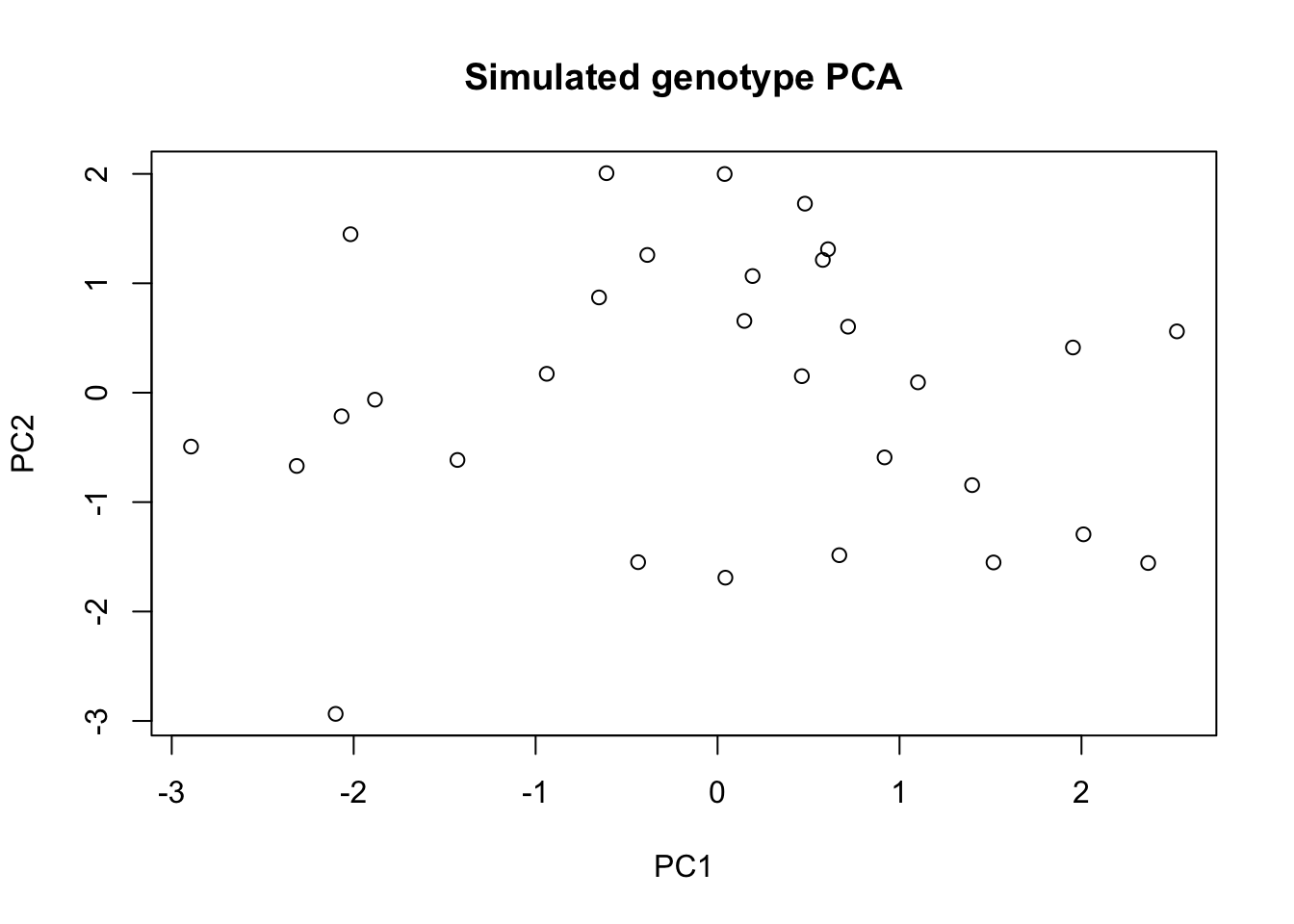
Now look at the real PC1/PC2 already computed for the red-spruce trees (from actual genetic markers, not simulated):
traits <- read.table("data/raw/red_spruce_fitness_traits.txt", header = TRUE, sep = "\t")traits$Region <- factor(traits$Region)
plot(traits$PC1, traits$PC2,
col = as.integer(traits$Region), pch = 19,
xlab = "PC1", ylab = "PC2", main = "Genetic PCA colored by region")
legend("topright", legend = levels(traits$Region),
col = 1:nlevels(traits$Region), pch = 19)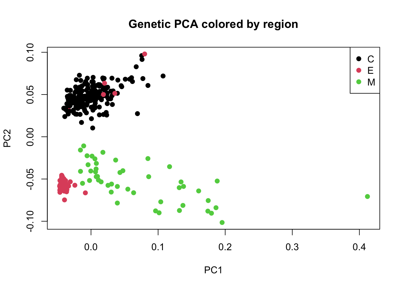
In population genetics, PC1/PC2 from a genetic marker PCA usually capture the strongest axes of population structure — often correlated with geography (isolation by distance) or major environmental gradients.
How everything connects
Everything in this module is one pipeline applied at increasing scale. Trace it end-to-end with a single question: “why is this locus heterozygote-deficient?”
| Step | Concept | Where you computed it | Red-spruce equivalent |
|---|---|---|---|
| 1 | Count genotypes | table(pop_1$genotype) |
— |
| 2 | Allele frequencies \(p, q\) | colMeans(geno)/2, allele counting |
— |
| 3 | H–W expectations \(p^2, 2pq, q^2\) | prob = c(p^2, 2pq, q^2) |
— |
| 4 | Observed vs. expected heterozygosity | Ho, He, het_table |
Genetic_Diversity |
| 5 | The gap: \(F = 1 - H_o/H_e\) | Exercise 7 | Family_Homozygosity (conceptually related) |
| 6 | Structure causes the gap | Wahlund effect (N = 500 demo) | Region, PC1, PC2 |
| 7 | Structure detected multivariately | prcomp() PCA plot |
PC1, PC2 columns |
| 8 | Structure + environment | cor.test(), lm() |
Elevation, Latitude |
| 9 | Many loci + environment jointly | vegan::rda() (stretch) |
RDA / genomic offset |
Three threads run through the whole table:
- The same two quantities everywhere. Every row is computed from genotype counts and sample size. Heterozygosity, F, the Wahlund effect, PCA loadings, and even the RDA ordination are all functions of allele frequencies — the only thing that changes is how many loci and how many environmental axes you let in.
- Structure is the recurring confounder. Pooling populations inflates apparent diversity (Part II, Wahlund), heterozygote deficits can mean either inbreeding or structure (Part III), and the PCA that reveals structure (
PC1/PC2) is also the covariate you must control before interpreting any genotype–environment association (Part III’slm()andrda()). A climate correlation that survives after accounting for structure is evidence of local adaptation; one that disappears was ancestry all along. - Scale changes confidence, not logic. With N = 20 at one locus, noise dominates (Exercise 6). With N = 500, the Wahlund effect is obvious. With 10 loci, averaging helps (Exercise 7). With genome-wide SNPs, per-locus estimates are noise but multivariate summaries (PCA, RDA) become powerful. The math you did by hand on a 2-allele, 20-individual toy is the same math inside
adegenet,LEA, and your genomic-offset pipelines.
When you reach the stretch exercise — rda() with Genetic_Diversity, Genetic_Load, PC1, PC2 as responses and Elevation, Latitude as predictors — notice what it is: rows 8 and 9 of the table. A correlation tests one response–predictor pair; the RDA tests all of them jointly, in the same way the PCA summarized all loci jointly. Multivariate = the same idea, more axes.
Roadmap beyond this module
When you’re ready to work with real genotype data instead of pre-computed summaries:
vcfR::read.vcfR()reads a VCF file into Radegenet::df2genind()/vcfR::vcfR2genind()convert genotypes into population-genetics-aware objects with built-in allele-frequency, heterozygosity, and Fst functionsLEA(Bioconductor) andvegan::rda()scale the GEA approach above to genome-wide SNP data
None of this is required for this module’s exercises — it’s here so you know where basics you learn connects to your actual genomic analysis pipelines.
Wrap Up
Idea check
Answer these before the practical exercises.
- What does an alternate allele frequency of 0.3 at a locus mean biologically?
- Why can observed heterozygosity (Ho) be lower than expected heterozygosity (He) in a real population?
- What do you think
Population_Homozygosityis measuring, and how would you expect it to relate toGenetic_Diversity— positively or negatively? - In a PCA built from genetic markers, what do PC1 and PC2 typically represent in a population-genetics context?
- Why test
cor.test(Genetic_Diversity, Elevation)rather than just assuming a relationship exists because both vary by population? - What is the conceptual difference between running a separate
lm()for each genetic variable versus running onerda()with all of them as a response matrix?
Practical exercises
- Build the simulated genotype matrix (30 individuals × 10 loci) exactly as shown, and compute the alternate allele frequency for every locus.
- Compute observed and expected heterozygosity for each locus and identify which locus shows the largest Ho − He gap.
- Run
prcomp()on the simulated genotype matrix and plot PC1 vs. PC2. - Load the real red-spruce dataset and plot the real
PC1vs.PC2, colored byRegion. Does the pattern look like discrete clusters or a continuous gradient? - Run
cor.test()betweenPopulation_HomozygosityandElevation, and separately betweenGenetic_DiversityandLatitude. Report the correlation coefficient, p-value, and a one-sentence interpretation for each. - Fit
lm(Genetic_Load ~ Elevation + Latitude, data = traits)and interpret the two coefficients — which predictor has a stronger association, and in which direction? - Stretch exercise: run the
vegan::rda()example above usingGenetic_Diversity,Genetic_Load,PC1,PC2as responses andElevation,Latitudeas predictors. Produce the ordination biplot and describe what you see in 2–3 sentences. - Save every summary table (allele frequencies, heterozygosity table, correlation results) and every plot into
results/.
Solutions for the simulation-based items (1–3) are worked through in Part I, the Part II exercises, and Exercise 7 — attempt them before unfolding those callouts.
Homework
Build src/02_pop_genetics_intro.R, combining the simulated-data fundamentals with a real-data GEA-style analysis.
Requirements:
- Part A (fundamentals): allele frequency and Ho/He table for the simulated genotype matrix, plus the PCA plot.
- Part B (applied): using the real dataset, test associations between at least two genetic-parameter columns (e.g.,
Population_Homozygosity,Genetic_Diversity,Genetic_Load) and at least two environmental predictors (Elevation,Latitude,Longitude), using correlation and/orlm(). - A written interpretation (half a page, as comments or a
results/README.md) answering: Do the genetic parameters show a spatial pattern with latitude or elevation? What ecological or demographic process might explain this (e.g., isolation by distance, local adaptation, drift in small/marginal populations)? - Bonus (optional): complete the
vegan::rda()ordination and include the biplot with a short interpretation of which environmental axis drives more separation among genetic variables.
Submission format: src/02_pop_genetics_intro.R, all generated outputs in results/, and the written interpretation.